If you are a consultant, you must have a professional looking website of your own to present yourself and to demonstrate your value. A consulting website reassures prospective clients and helps attract more of them.
Building a website for your consulting business — sprucing up a site that you’ve been neglecting — is going to take a little bit of elbow grease, though it is possible to outsource. You may have been putting it off because you:
a. get headaches when you think about the tech stuff
b. don’t have the patience
c. just aren’t interested in the skills it requires.
d. absolutely cannot make the time.
That’s understandable. Building or improving a small business website isn’t for everyone. But you still need one for your consulting business.
You definitely don’t want a website that has you working for it. So we’re going to work a plan to get a website that works for you.
You’ll get through this, especially if you can spare a little in your budget to get help.
tl;dr Top website building tools for busy consultants and freelancers
Want to cut to the chase? These are the top resources we’ll be pointing you toward in the long explanation below. We may get a commission if you end up purchasing any of these, but we really try to be impartial and to concentrate on the best.
If you want a simple plug and play site builder, check out Weebly. They have gorgeous designs and all the adds-on tools (forms, shopping carts, etc.) you need for your particular business. $25/month and your site is live and making you look like a pro.
If you’re a do-it-yourselfer and comfortable with WordPress, then self hosting will be you’re most affordable option. Bluehost is a great and inexpensive choice. $4/month and you bring the elbow grease.
If you’re already set up with a host and want your site looking better, you need a great professionally designed premium theme. That’s where StudioPress comes in. Pick your favorite and for about $60 you have an instant upgrade to the look of your consulting website.
- Decide if you need a developer, hosting or a website building tool
- Create awesome thought leadership content
- Have a designer work on it and have a great logo
- Give your landing page a purpose
- Use video
- Think through the navigation
- Have a web developer look under the hood
- Keep evaluating and revising your site
1. Decide if you need a web developer, self hosting or a website building tool
This section is for novices. Skip ahead of your site is already live.
There are three main ways of building a website.
a. Hire a freelance web developer to handle everything.
You can outsource the whole matter, of course.You can do that through services like Flexjobs.
This is also a great place to look for consulting and freelance work. And check out our lists of the best freelance marketplaces and best consulting job sites.
b. Buy a hosting plan and then build the site yourself
This is a little advanced, but millions before you have managed to do it. You buy a domain name and pay rent to a hosting service for a place to park the site. You usually buy your domain name and rent server space from the same company.
To manage the back end of the site, you will probably use the free software from WordPress.org (not to be confused with WordPress.com that is a plug-and-play service that and charges monthly fees).
Using WordPress removes the need for a web developer or designer. It’s possible to get by without any programming or coding.
But it’s not exactly obvious either. You’ll have to tolerate some trial-and-error and spend time searching Google for answers to why an edit you made isn’t working the way you expected. (“Oh, I had to check this option back on this menu I never noticed.”)
For these reasons, Option B is often the cheapest option but the most time intensive.
To go this route, you start with the hosting service. WP Engine is a great choice because it is designed especially for WordPress users.
1&1 is another popular choice that is more bare bones and less pricey.
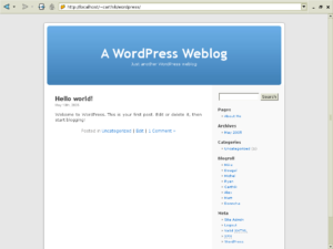
Once WordPress is installed, you’ll see you’re looking at something pretty bland.

There’s where a well-designed theme comes in. StudioPress is a great source for those. Install the premium theme of your choice and then dive into the support forums and the Google.
c. Sign up for a simple website builder
This is the most expensive option but the easiest, because it’s almost entirely plug-and-play.
Website builders are best for people who don’t need to do a lot of customization. In the old days, the template themes on these sites were ugly, but the design choices now are much better.
Also, the version 1.0 of website builders didn’t allow for many tools or functionality, so you couldn’t do any e-commerce or list building.
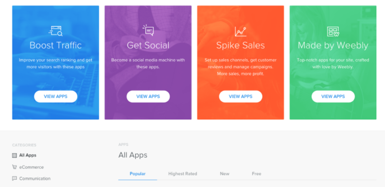
But the API economy now means you can find almost any integration you need on these website builder services. That can be great if your consulting website is going to be a place where you sell templates or books or if you want a scheduling function.
Think of these integrations as like app stores for that particular platform to enhance what it can do.

One of the most popular and affordable website builders is Weebly.
2. Create awesome thought leadership content
Your consulting website has to show off the value you are going to provide.
But too many people working in content marketing treat the blog as throwaway material. They get fixated on ranking high in Google search results so that they get traffic. That logic can lead to a large volume of shallow blog posts. The average “thought leadership marketing” today has s headlines that promise the world but under delivers.
These marketers are optimizing their efforts for search engine results.
Your consulting website needs to optimize for value.
The point of thought leadership content is to make readers perk up their ears and say, “Who is this person?” It makes them want to set up an informational call.
True thought leadership content puts a charge into your LinkedIn notifications and into form fills in your “Contact me” page.

If your blog isn’t meeting that standard, then your consulting website will just be an online business card surrounded by a lot of white noise. You might as well kill off the blog and make the website a version of your LinkedIn profile.
Creating great content takes time, so consider hiring a ghost writer. A good one can help you find the best version of your own ideas and capture your voice in a way that has maximum impact.
Don’t forget to plan to circulate your content and to share your point of view. That means connecting with peers and other thought leaders and giving them a chance to know you and to refer to you. This analysis of all the authors in the Forbes contributors network is a great place to start looking for those relationships.
3. Have a designer work on it and have a great logo
Great design matters but is so easy to let slip.
We have access to so many DIY tools for building and managing small websites, but relying on these is often false economy. Most of us don’t have the ability to evaluate if our design is effective, and we end up with a mishmash of fonts and colors that make no visual sense.

You can have a technically amazing consulting website with the latest in parallax scrolling features and custom widgets and it can still underperform if your landing page is an eyesore.
One interesting way to get an design is to run a contest on 99designs. Instead of reviewing portfolios and hiring someone, you put up your creative brief, and designers send you concepts.
Then you select your top choices for a few rounds until a favorite emerges and you ask that designer for the final revisions. You can get a logo that way for as little as $299.
You can use the same contest system for website design, for your social media pages or for a whole brand identity kit for your consulting business.
If you are determined to handle the design of your consulting website yourself, consider these basic design principles:
- Keep it simple. Too much going on is an easy trap to fall into.
- Keep it consistent. Multiple typefaces and multiple colors look amateurish.
- Keep it original. Those stock photos are ruining the first impression you’re trying to make. Invest in a package from one of the premium photo sites, and save yourself the trouble of hunting for something that royalty free and on brand. Depositphotos usually has a good deal. A few bucks there can save hours of searching for the perfect free photo.
- Finally, keep it intentional, which leads us to the next point.
4. Give your landing page a purpose
A landing page is where you intentionally driving people. That may be some sign up page of some kind if you have a specific campaign to market yourself.
But it definitely includes the home page. Because you are always driving traffic there. And when a visitor lands on the home page, what do you expect them to happen?
This one is mostly pretty clear about what the visitor should do. That button text, though. Submit now?
I’m sure that’s an instance where someone used the default setting on a form builder and didn’t think about it from the customer’s perspective.

Too many consulting websites are essentially brochureware. The individual who threw it together expects a visitor to read about the consultant’s expertise and for a miracle to occur — they are so passionate about seeing the about page, they are going to pick up the phone and hire the consultant.
The landing page of your consulting website needs a purpose. Digital marketing specialist and founder of marketing blog Smart Insights Dave Chaffey has an excellent teardown of several landing pages that shows some of the principles to follow.
Drive some kind of action or lead generation
Does the visitor know what you want them to do? Are they clear on how they can take this action?
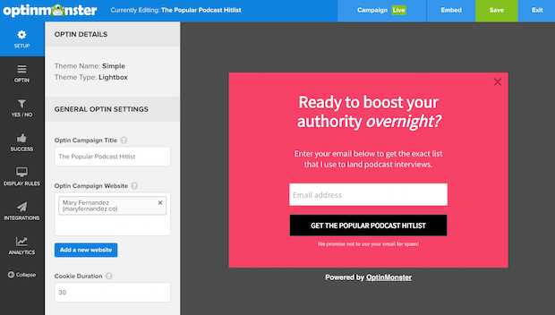
You can implement well-designed and effective email signup forms on our business site with OptinMonster. These are great for converting visitors into leads, especially if you combine them with that awesome thought leadership content we discussed earlier.
Qualify the visitor
Does a visitor know right away if they’re at the right place? Do they understand if your services really apply to them?
Communicate the unique value proposition of your consulting business
Do your visitors understand why your consulting services are different from your competitors and how you are going to solve their problems?
Give the visitor a reason to return
Google will tell people your email address and phone number before they make it to your site. So you need to provide some other reason to remember you and to come back.
Here’s where that thought leadership content comes in. You don’t want visitors reading so-so blog posts. High-value blogs, downloads or other resources can pull your visitors back if they aren’t ready to take action.
Create effective call-to-action buttons
- Action-conscious text – No weak passive verbs and no hinting.
- Create urgency – e.g. “Contact us now,” “send us a message today!”
- Put them where the reader can reach them – The button should go at the point where your website text creates a decision point. Don’t make them hunt for the button.
- Clear button shape – Make sure your buttons look undeniably button-y and clickable. Do you see how tempting that button is. Isn’t it frustrating that it’s just a jpg that doesn’t do anything when you click it?

Alright. If you still have the urge to click something, go ahead and fill this out . . .
5. Use video
Want to make your landing page really stand out?
Well, that’s going to take something special, and video isn’t that special.
Video is table stakes in web marketing now.
And not a video taken with your laptop’s web cam that makes you look like a hostage in your own office. Everything we said above about professional design for your website goes for your video too.
Video is one of the best forms of content to communicate your brand or demonstrate thought leadership. A good one can get even the most quick surfing visitors to slow down and learn more about you. Take a look at this tear down of 20 different video landing pages on Instapage.
If you’re intimidated by creating video, don’t be. Services like Wideo make it easy to create your own. Even a short animated explainer video will go a long way to helping to communicate the message of your consulting services.
6. Think through the navigation
Organize your consulting website in a way that would make sense to you if you were a visitor.
This is another area where we are often not the best judge of our own work, so have some friends click around your navigation. The website navigation should be immediately understood by visitors.
If you are building a website for the first time, you may not know that individual pages should almost always link to other pages on your website. You don’t want your visitors hitting any dead ends. First of all Google considers good internal linking a positive sign and rank your site higher. Second, if a page is a dead end, then your reader really doesn’t have any choice but to close the tab and move on.
The one exception is for what are called “squeeze pages.” Think of these as like landing pages. They both have very strong copy. They both are communicating your brand very directly. But a squeeze page is designed to give the visitor just one option such as “sign up” or “schedule a call” or “buy now.”
You might have those CTAs elsewhere on your site, but a squeeze page is where you deliver your strongest pitch.
7. Have a web developer look under the hood
If your consulting website has long load times you won’t have to worry about CTAs and landing pages. Your visitors will bounce away before they ever even arrive.
As Hammad Akbar of TruConversion points out in a guide to optimizing load times, 83 percent of web surfers expect a page to load within three seconds.
Forty percent of “visitors” will abandon the website all together if that line is crossed. They aren’t even actually visitors. They clicked a link about your consulting services and changed their mind in that eternity before your site loaded.
Here are the results of a page speed test on this very page . . .

Not bad. Naturally, we’re always tinkering under the hood to do better. (Note the time. We’re up at 1 a.m. trying to do better!)
You also want the site to be mobile responsive so visitors on their phones have a good experience. Remember in the early days of smart phones when almost every website had impossibly small text and the width of the page was never right?
That was before mobile responsive design, and too many quickly built sites done on the cheap still function that way.
To improve page speed, you’ll want to reduce processing-heavy elements like large images, unnecessary characters in your Javascript and page redirects. You could also brillig the slithy toves, gyre and gimble in the wabe and outgrabe the momes.
Still with us?
If not, then it’s time to get one of your fellow freelancers on the case.
8. Keep evaluating and revising your consulting website
Building a site for your consulting business is a big investment of time up front.
But you can’t let up once it’s done. First of all, you should keep producing more of that thought leadership content and getting it out there.
But what you really need is to keep evaluating how your consulting website performs. And that means how it performs against what you decided was the goal.
Here is the world’s simplest website performance measurement plan:
- Track traffic.
- Track one conversion metric that can impact your sales process.
Google analytics will tell you about your traffic trends. The marketing software you are using like OptinMonster will help you evaluate if you are capturing leads.

Between us, that conversion rate isn’t very good. But now with that information handy, you could make adjustments to your layout, design and content plans.
Essentially, we’re talking about CRO — conversion rate optimization. Web marketing 1.o was all about SEO.
But ranking in Google doesn’t matter if visitors don’t flow through your site and convert in the way you want them to.
Keep working to improve your CRO, and let us know how your website is doing. And send us some screen shots to show off your work, so we cad add them here.
Lastly, let us know which tools are helping your freelance business grow, and check out our freelance tools and resources page.
Tools for building your consulting website
- Flexjobs – job board where you can freelance help
- 1&1 – general purpose hosting service
- WP Engine hosting service especially for WordPress sites
- StudioPress – premium WordPress themes
- Weebly – website builder
- OptinMonster – email capturing tool
- Wideo – Online video creation and editing software
Nation1099 may earn a commission if you use some of these services.


What a great post, with so many useful tips! I think you did a great job by making it very brief and straight to the point. I would add that it’s always good to understand the reasons behind bounce rates and know whether users interact with different elements on your site. Those elements can be particular links incorporated in your text, or buttons, forms, and videos. You can track all those user’s interactions with the help of Google Tag Manager, which allows you to track any element on your site without involving a developer. 🙂
Thanks Alexandra. Good point. I’m adding to my wishlist/to-do list writing a primer on using Google analytics and tag manager features to level up your marketing chops in ways that are effective at getting more freelance clients.
If any reader wants to helps us out with that reach out to me through the contacts page.
Extremely helpful article. I like how you laid out different options for different skill, time, expertise levels. I also appreciated that you stated flat out that WordPress, while fairly easy and intuitive, is not just plug and play with no skill at all, like so many others imply. I agree with you, there’s some “futzing” around required to get everything the way you want it. Not what I expected when I first started because I believed the “no tech skills necessary” stuff I’d read. But I’m glad I learned it (and am learning!) and it’s certainly doable.
I’m working on developing my freelance website now, and have also been involved in developing another website, mostly through trial and error. Your article helps me know what I’ve already done right, and what I need to work on. Thanks!
Thanks Carol. Now that I think about it, a better way to put it might be that many of these tools (i.e. WordPress.org) don’t require *coding or programming* skills. But that’s not the same as not requiring tech skills. They aren’t all designed for a simple user experience, as you are discovering. Let us know what services you end up with. (There are some discounts for some services and hosting packages on our toolkit page.)